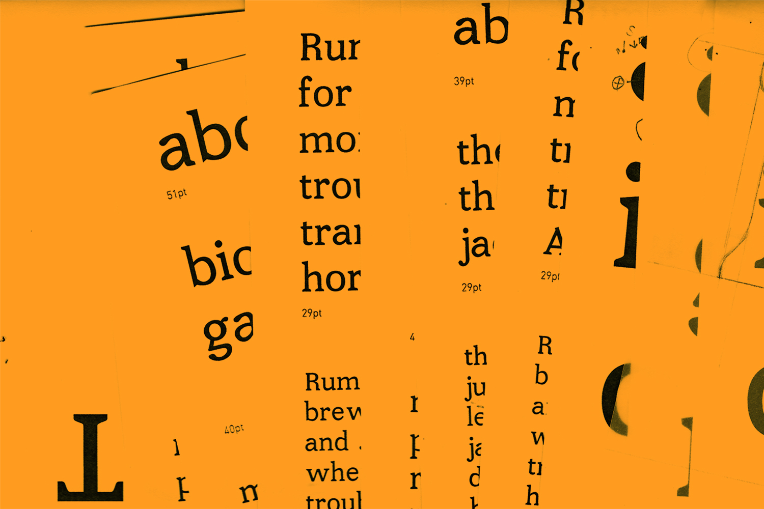
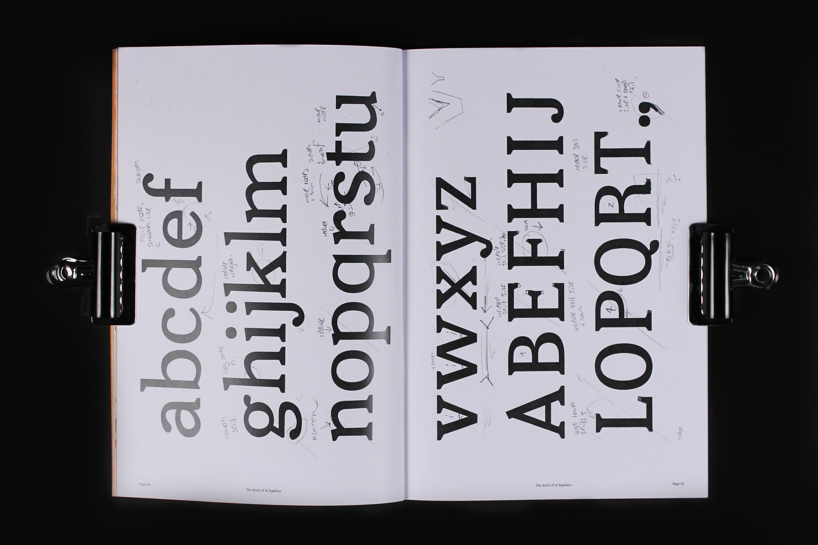
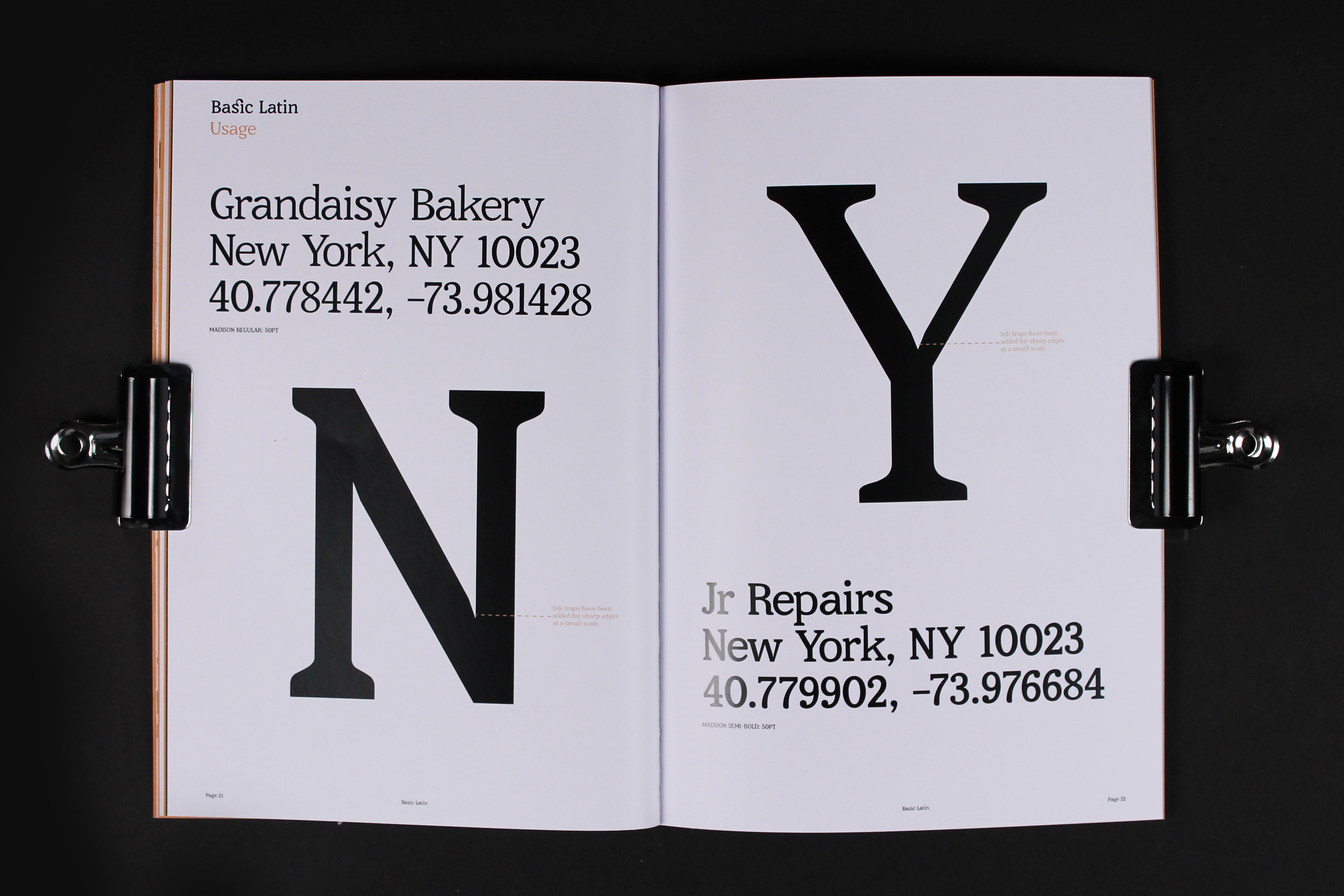
Typefaces used in 1960’s advertising had high x-heights, with small ascenders and descenders. This allowed designers to squeeze in large amounts of copy, at a large point size, in a small area. Madison uses the shape and form of these characters, but with a larger contrast in letter form heights, allowing readability at a smaller scale.
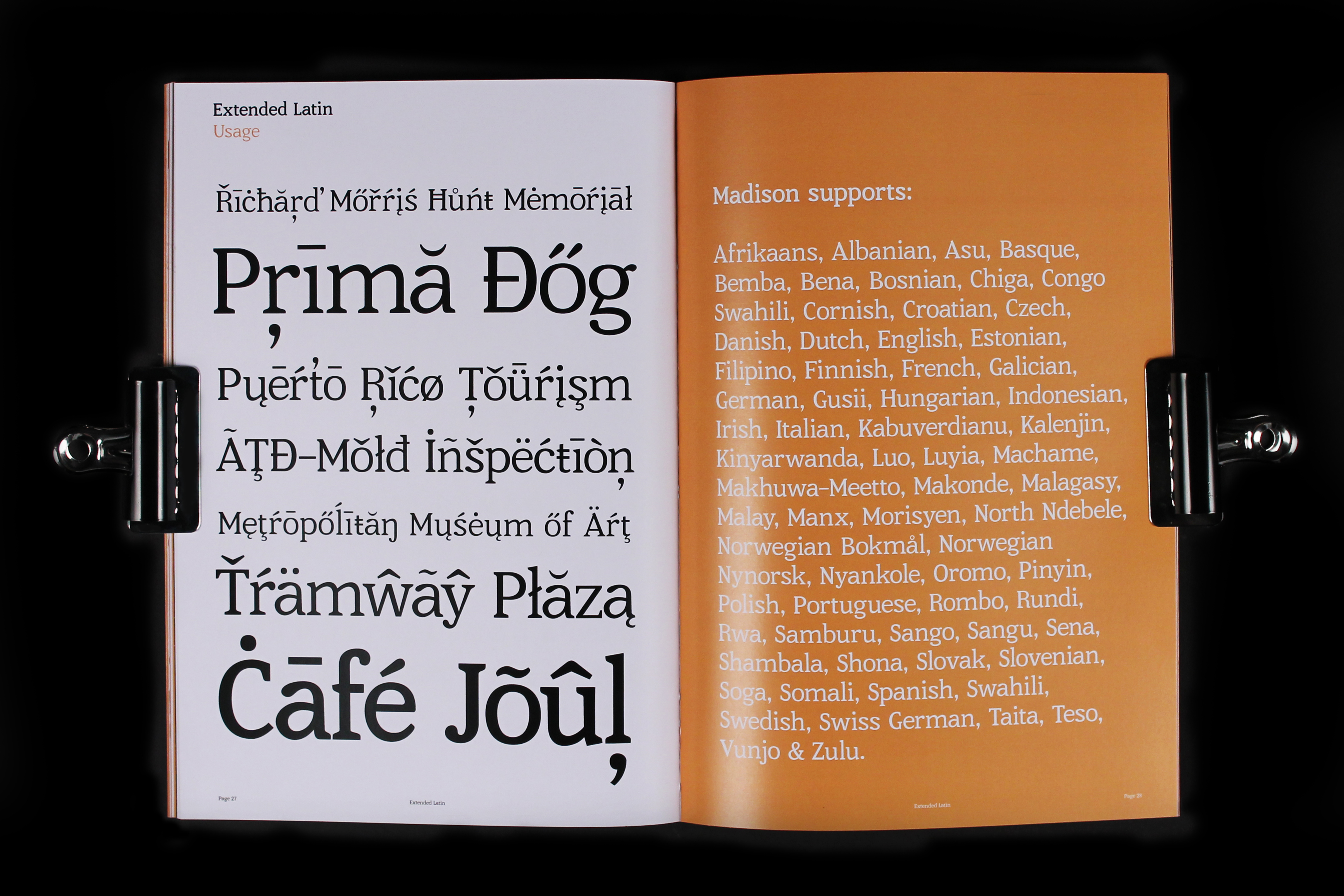
Both Regular and Semi-Bold are fully supportive of Western European, Eastern European, Central European, South Eastern European, Pinyin & Afrikaans.
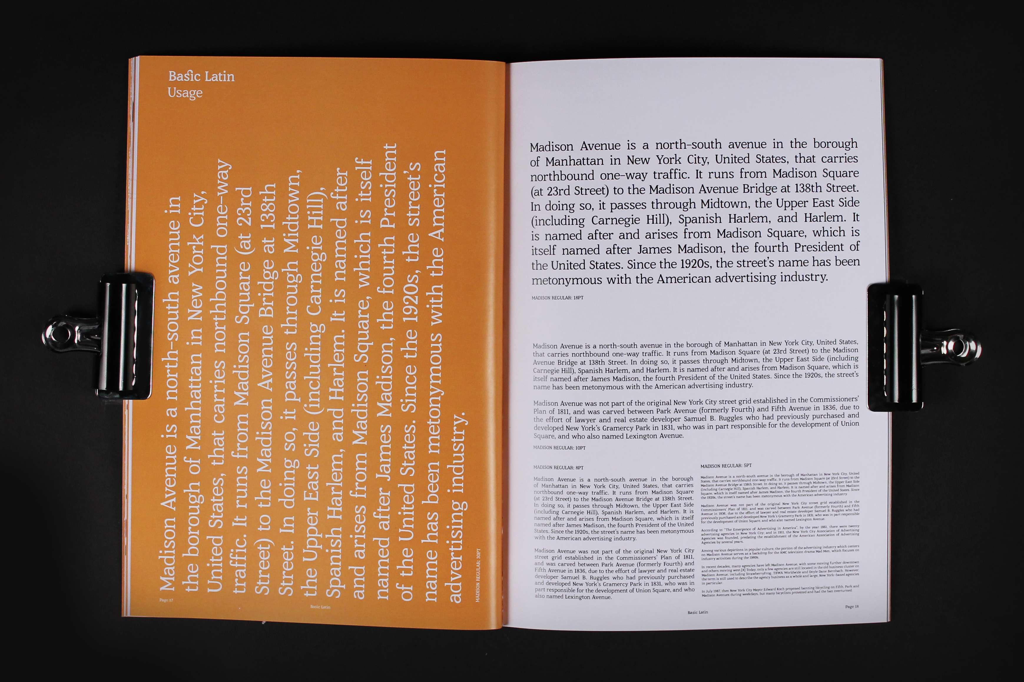
The two colour specimen uses black and white, and Pantone 123U, also known as 'New York Taxi Orange'.
The examples used withing the specifmen were selected using a systematic process. 'Madison' in Semi-Bold was overlayed over the centre of Madison Avenue, and the anchor points were pin-pointed to certain addresses.
↑ Back